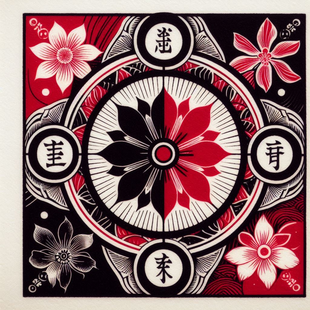
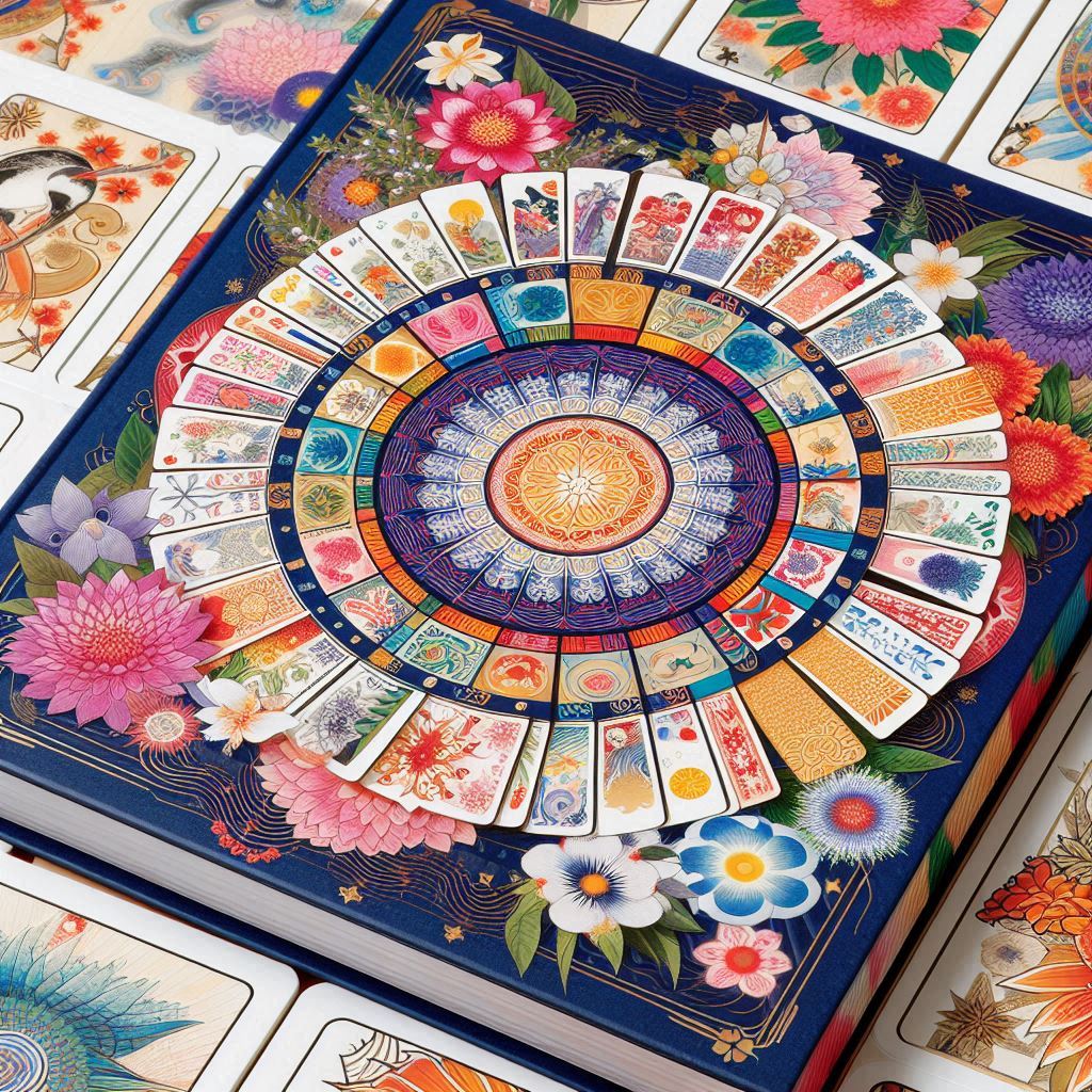
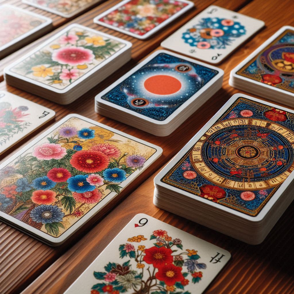
The choice of black and red colors for Hanafuda cards by Nintendo in the late 19th century was deeply rooted in Japanese culture, aesthetics, and the technological capabilities of the time. These colors were not chosen randomly. Let’s explore why these colors were selected and what they symbolize.

Symbolism of Red in Japanese Culture
Life and Energy: Red is traditionally associated with life, energy, and vitality in Japan. It symbolizes the rising sun, fire, blood, and passion. In Japanese culture, red often represents the idea of eternal life and renewal.
Festivals and Celebrations: Red is widely used in decorations and clothing during festivals and special occasions, such as the New Year (Shōgatsu) and weddings. It symbolizes joy, happiness, and celebration, creating a festive atmosphere.
Courage and Strength: Red also represents courage and strength. Historically, samurai wore red armor, symbolizing their bravery and fighting spirit.
Symbolism of Black in Japanese Culture
Earth and Stability: Black symbolizes the earth, stability, and wisdom. In traditional Japanese art, black is often used to represent stability and solidity.
Mystery and the Unknown: Black is associated with mystery and the unknown. It represents nighttime, when much is hidden from view, and emphasizes mystery and hidden depth.
Death and Rebirth: In some contexts, black can symbolize death. However, it also represents rebirth, as a new day always follows the night. This duality makes black a symbol of cycles and renewal.
Red and Black Combination
The combination of red and black creates a striking contrast that catches the eye and is memorable. In Japanese culture, this color pairing is often used to create expressive and memorable visuals.
Duality: Red and black represent opposites, such as life and death, light and darkness, good and evil. This reflects the deep understanding of duality in Japanese culture and philosophy.
Dramatic Effect: The contrast between red and black creates a dramatic effect, making the cards more interesting and memorable. This combination enhances the visual impact and highlights the importance of the symbols depicted.
Aesthetics: Together, red and black create a vivid and striking visual image. This combination is easy to perceive and remember, contributing to the popularity of Hanafuda cards.
Technology: Using two colors simplified the printing process and reduced production costs. In the late 19th century, when printing technology was not as advanced, using a limited number of colors allowed for high-quality images at lower costs.
Why Were Hanafuda Cards Different Colors Before Nintendo?
Before Nintendo’s era, Hanafuda cards used softer and pastel colors, reflecting certain aspects of Japanese culture and aesthetics of that time:
Soft and Pastel Colors: Early Hanafuda cards often featured soft pastel shades, such as pinks, blues, and greens. These colors created a calm and refined visual impression, aligning with traditional Japanese views of beauty and harmony. Soft colors were popular for creating delicate and sophisticated images in Japanese art and design.
Changes in Design and Aesthetics: Over time, preferences and aesthetic views changed. In the late 19th century, with industrialization and advances in printing technology, there was a shift in Hanafuda card design. Bright and contrasting colors, like red and black, became more popular due to their ability to attract attention and create a striking visual effect.
Symbolism and Cultural Preferences: The shift to red and black also reflected changes in symbolism and cultural preferences. These colors began to represent more modern and dynamic aspects of Japanese culture, such as energy, passion, and drama.
Technological and Economic Factors: The introduction of red and black colors was also linked to technological and economic factors. While soft and pastel colors required more complex and expensive printing processes, using two main colors was more economical and technically feasible.
The choice of red and black for Hanafuda cards was based on both aesthetic and cultural considerations. These colors not only created an appealing visual image but also carried deep symbolic meaning, reflecting key values in Japanese culture. The combination of these two colors made Hanafuda cards recognizable and memorable, contributing to their popularity. The transition from soft pastel colors to bright and contrasting colors was a result of changes in aesthetics, cultural preferences, and technological capabilities, making Hanafuda a more expressive and modern art form.
#hanafuda #japan #cards #hanafudacolours


